Common Media Mistakes That Cost Showings
Buyers decide whether a home is worth seeing in person in seconds. Not minutes—seconds. And in today’s market, that decision almost always happens on a phone, while scrolling, comparing, and filtering aggressively. That’s why small media mistakes don’t just make a listing look “less polished.” They directly cost showings by creating doubt, confusion, or a lack of emotional pull.
At Bridlepath Photography, we see the same issues come up again and again—especially on otherwise beautiful homes.
The property is strong, the location is strong, the price might even be right, but the media quietly underperforms. Here are the most common mistakes that reduce clicks, saves, showings, and offers.
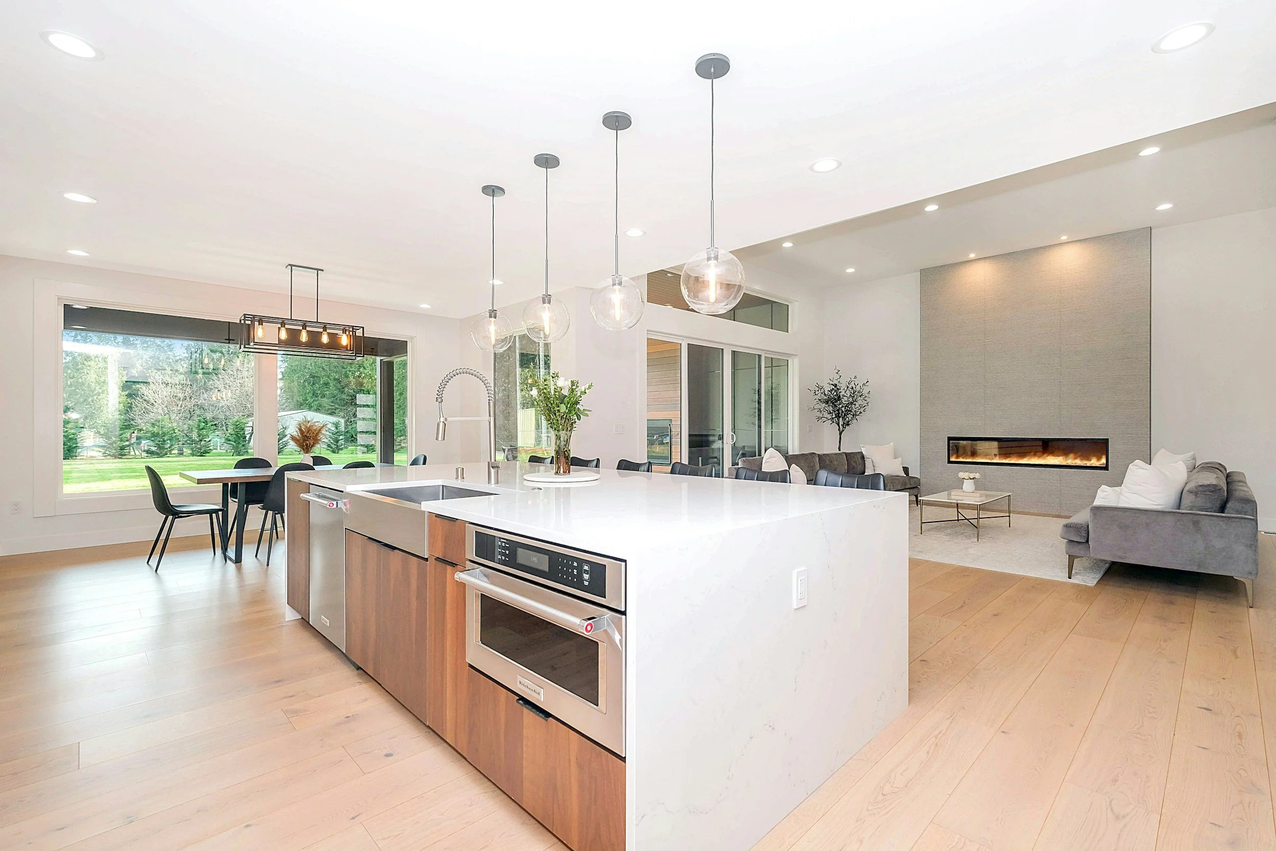
The first is bad verticals, and it’s one of the fastest ways to make a home feel “off.” When walls lean, doorframes tilt, and kitchens look like they’re sliding downhill, buyers may not consciously identify the problem—but they feel it. Bad verticals create a subtle sense of distortion and distrust, like the home is being “pushed” or manipulated. On luxury listings especially, vertical precision is non-negotiable. Clean geometry communicates quality. Messy geometry communicates amateurism.
Closely tied to that is inconsistent color. If one room looks warm and yellow, the next looks blue, and the next looks grey-green, the home starts to feel disjointed. Buyers can’t tell what’s paint, what’s lighting, and what’s editing. Inconsistent white balance makes finishes look cheaper, floors look mismatched, and cabinetry look like it changes colour from photo to photo. The result is friction—buyers hesitate because they don’t trust what they’re seeing. Consistency in color and tone is what makes a listing feel cohesive, premium, and real.
Another major mistake is simply having too few photos. For higher-end listings, “minimal photo sets” are not modern—they’re incomplete. When coverage is thin, buyers fill in the gaps with doubt. They assume the missing angles are hiding something, or they can’t understand the flow well enough to justify booking a showing. Nice properties deserve deep coverage because the buyer needs to understand layout, sightlines, scale, and features without guessing. A listing with 20–35 photos often forces the buyer to work too hard. A listing with 80+ strong, non-redundant photos reduces uncertainty and speeds up decisions.
Then there’s the mistake that’s most common in vacant or transitional homes: no staging plan.
This doesn’t always mean “traditional staging,” but it does mean having a strategy for how the home will read online.
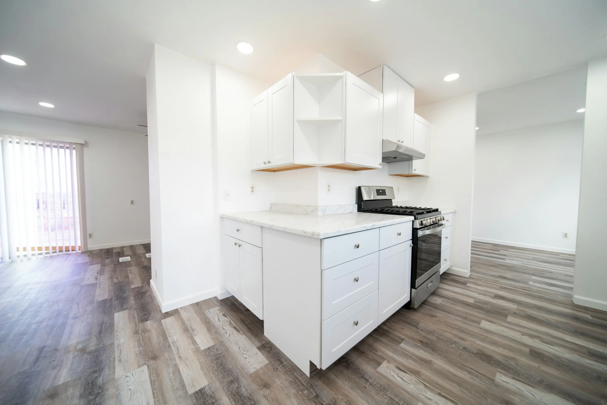
Empty rooms often feel smaller and colder in photos, and buyers struggle to understand purpose and scale. Unfinished basements, awkward bonus rooms, and large open areas are especially vulnerable. Without a staging plan—whether physical staging, light styling, or ethical virtual staging—the listing becomes harder to visualize. When a buyer can’t quickly imagine living there, they don’t book the showing.
One of the most overlooked problems is the weak hero shot. Every listing needs a single image that stops the scroll. If the first photo is an awkward angle, a dark foyer, a half-revealed kitchen, or a flat exterior, you lose people immediately—even if the home is incredible. A hero shot should be clean, bright, composed, and instantly understandable. It should communicate “this home is special” in one frame. When that first impression fails, the buyer often never reaches the better photos later in the set.
Another mistake that ties all of these together is relying on “good enough” editing. Editing isn’t about filters; it’s about precision—vertical correction, consistent white balance, highlight control, and a premium finish without making the home look fake. Overprocessed HDR, muddy shadows, blown windows, or overly dark images all reduce confidence. If the listing doesn’t feel trustworthy and elevated, the buyer assumes the in-person experience won’t match.
These mistakes are costly because they interrupt the buyer’s decision cycle. A strong listing should make a buyer feel two things quickly: clarity and desire. Clarity comes from coverage, accurate geometry, and consistent color. Desire comes from a strong hero shot, editorial-quality compositions, and media that captures mood. When either element is missing, showings drop.
The good news is that these issues are fixable, and fixing them doesn’t require changing the home—just changing the way it’s presented. Straight verticals, consistent colour, deep photo coverage, a staging plan for empty or uncertain spaces, and a strong hero shot are the basics of a high-performing listing. When those fundamentals are handled properly, the home competes at the level it deserves.
If you’re preparing to list a quality property, the question to ask isn’t “Do we have photos?” It’s “Does our media remove doubt and create emotion?” When the answer is yes, showings follow—regardless of season.